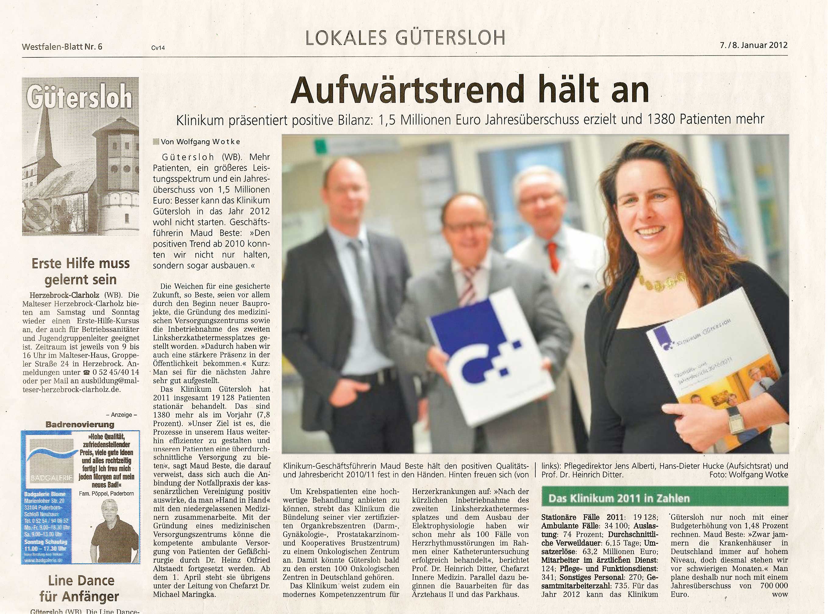
Klinikum Gütersloh corporate design
Klinikum Gütersloh’s transition from a municipal hospital to a commercial enterprise created the need for the total repositioning of the company.
Studio Ninaber assessed the wishes and needs of external stakeholders and representative members of the organisation and identified the desired identity in a collaborative process. Key concepts that emerged from this process include clarity, healthy success, working at eye level, a trusted atmosphere and primarily also recognisability.
The desired identity serves as the foundation for all of the steps to be taken by the organisation, including the development of the corporate design, which must also feature the hospital’s involvement with the city of Gütersloh. Studio Ninaber has developed a logo with an image and a brand name. This logo will either include the symbols G+ (for Gütersloh and hospital) or Gt (Gütersloh’s car registration letters). The logo will serve as a label, a type of hallmark, which will make the communications mutually recognisable.
Studio Ninaber has designed the corporate design’s complete representative set, which includes the correspondence, signposting, marketing communications (such as the annual report) and an introduction gift for staff members and external stakeholders.